- Employee Benefits
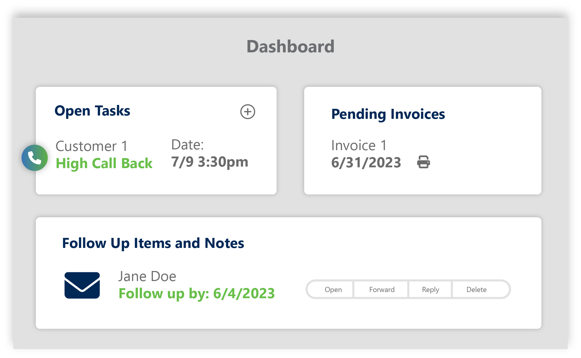
- Sales CloudStreamline mission-critical benefits workflows - from prospecting to renewals - fueling organic growth for your agency.
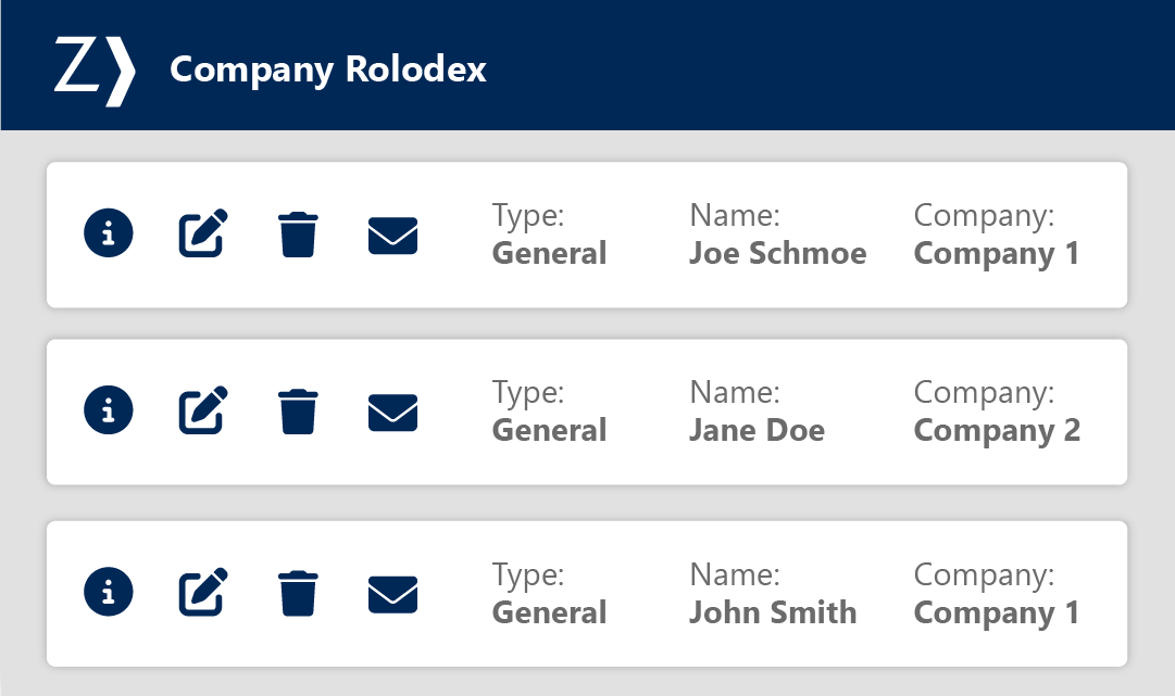
- Client CloudBetter serve your clients & your bottom line by providing added tools and resources.
- Content CloudHarness the power of employee benefits content to drive growth through engagement and education.
- Analytics CloudDeliver confidence with medical plan analysis.
- Commercial Lines
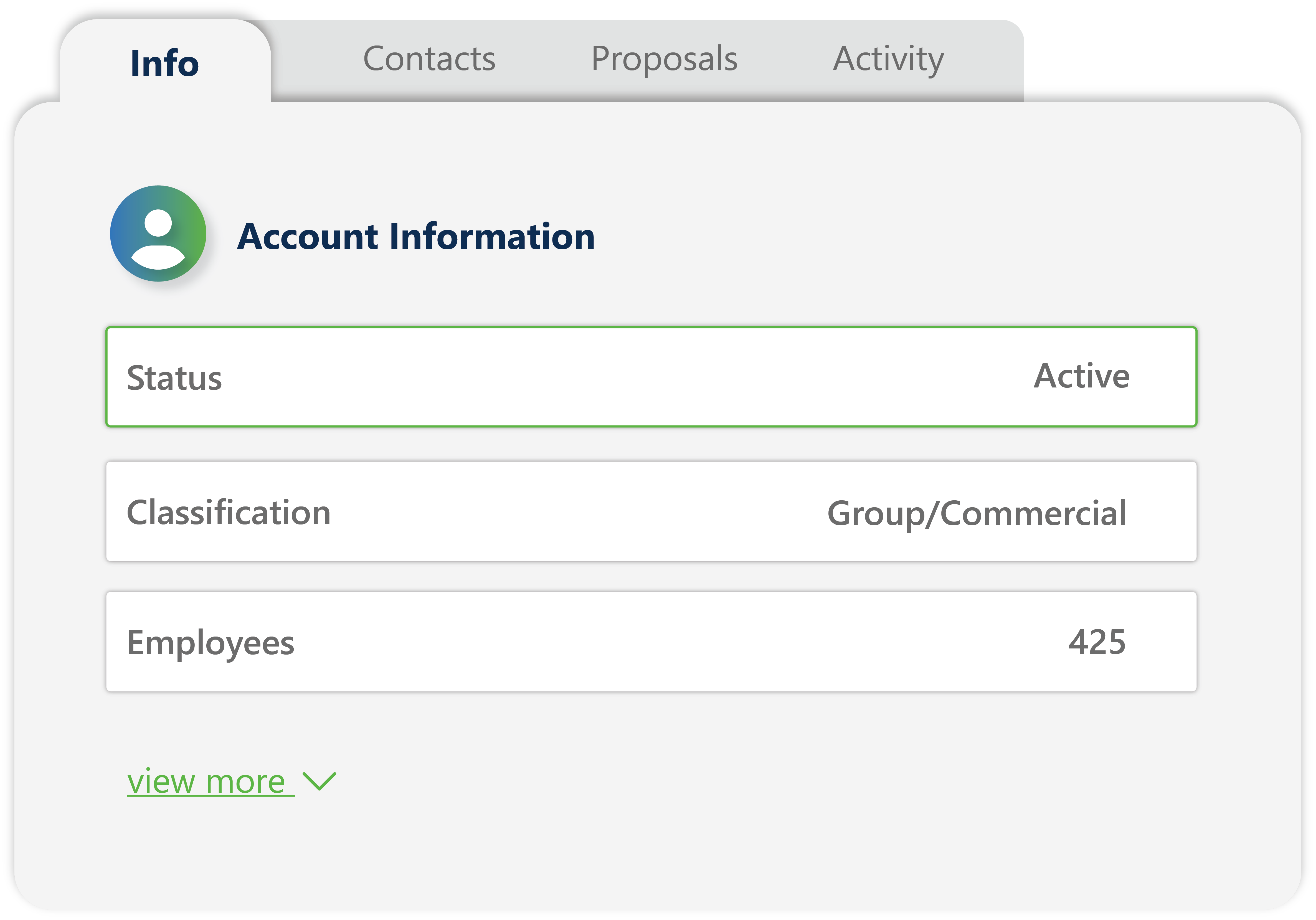
- Sales CloudStreamline mission-critical P&C workflows - from prospecting to renewals - fueling organic growth for your agency.
- Client CloudHelp clients self-serve, manage their people through compliance, risk management and safety solutions.
- Content CloudHarness the power of P&C content to drive help manage risk and drive engagement.
- Analytics CloudClaims and loss analysis made easy to drive value.
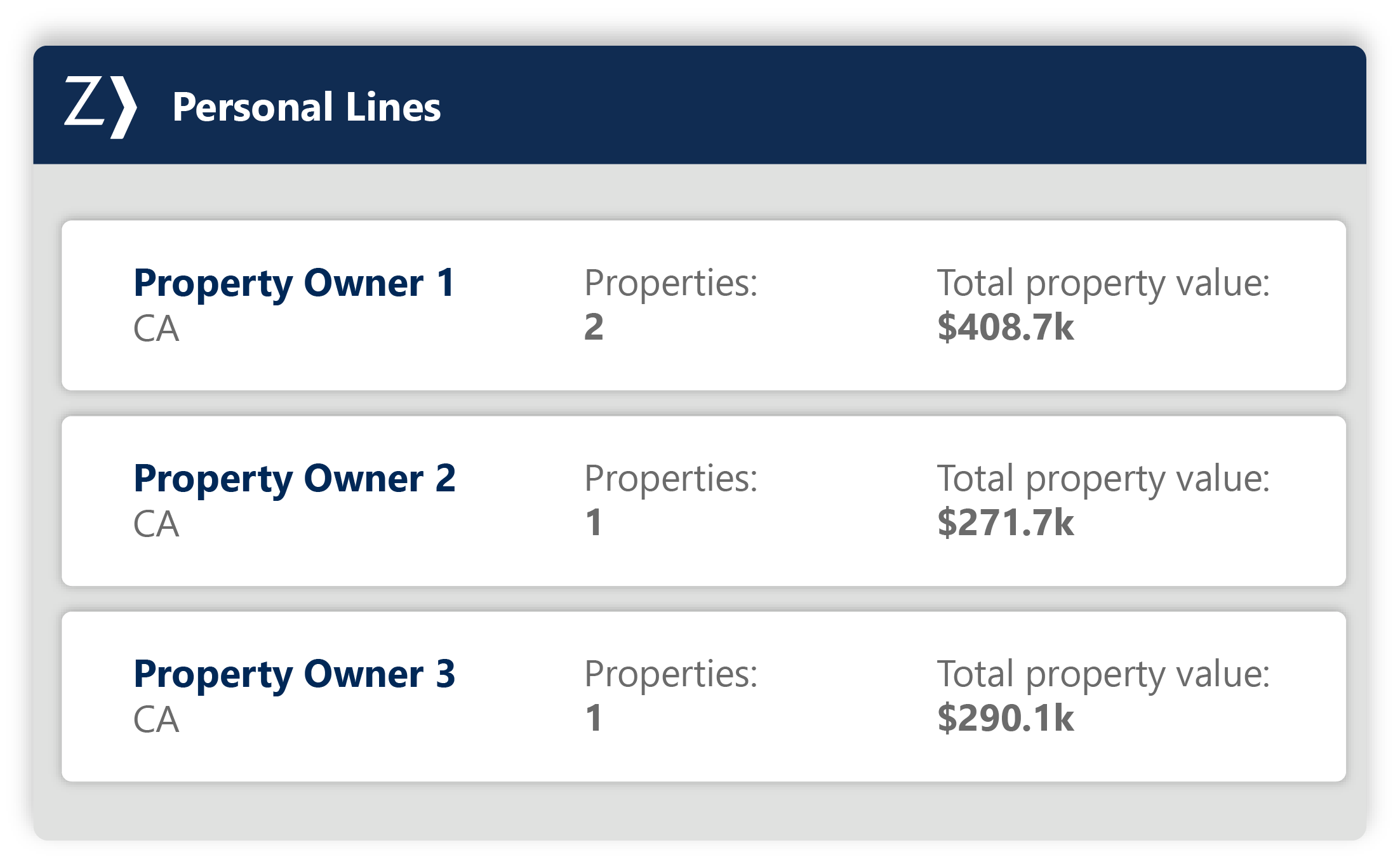
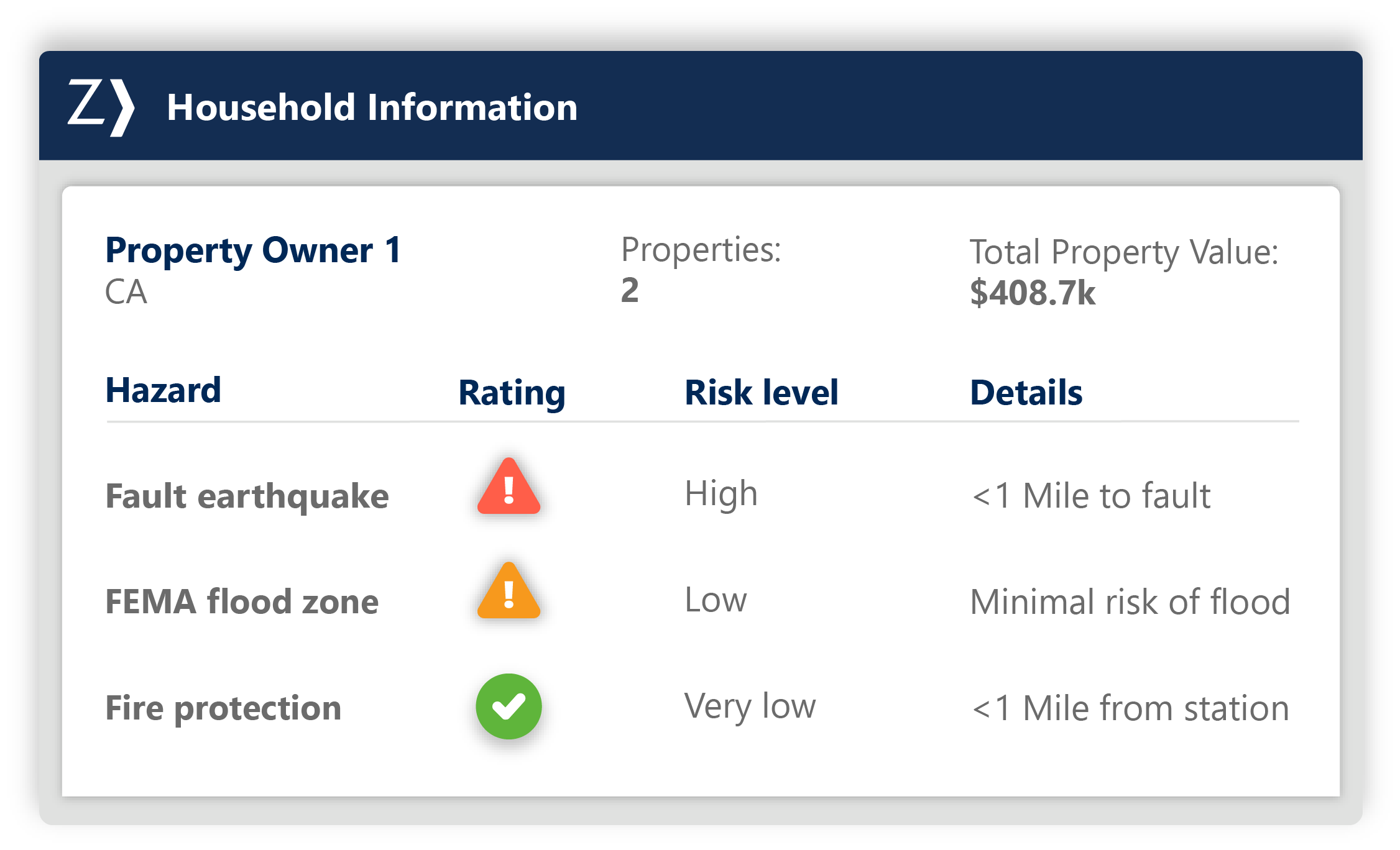
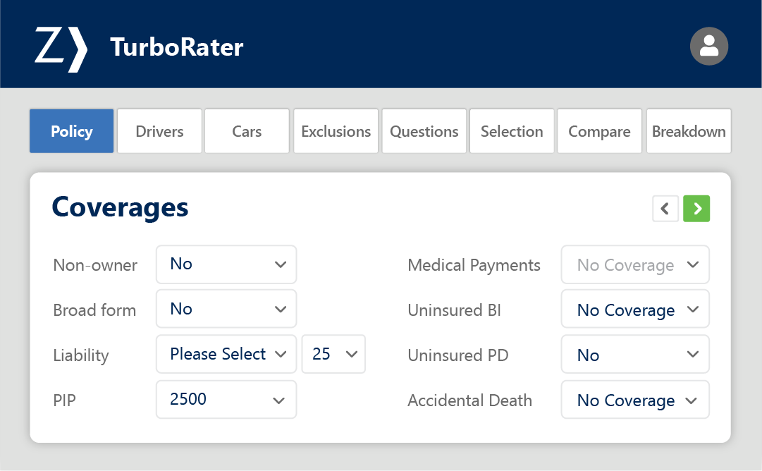
- Personal Lines
- Employee Benefits
- Insurers
- Service Providers
- Training & Support
- Events
- Resources
- About Zywave